Website Conversion Fundamentals
Getting Users to Take Action on Your Web Page
Websites come in all shapes and sizes - from simple brochure websites, to complex, highly customized enterprise-level sites. But no matter the area of business or the type of website, the one thing that generally ties them together is that they each exist to serve a purpose, and more specifically to produce some type of action from site visitors. After all, the time, effort and cost you've invested into driving visitors toward your website is ultimately of little value if your site visitors don't respond.
The actions that you want visitors to take on your website/landing pages, commonly referred to as "conversions", can be greatly impacted by a number of variables that influence whether or not a user is likely to take the next step and convert from an anonymous visitor into a new prospect, a customer, a donor, or registrant.
So how do we increase the odds that a visitor will take action on your site's landing pages? There are several key areas that can help:
- Define an action
- Make it prominent
- Make it easy to accomplish
- Apply a call-to-action
- Emphasize the benefit
- Consider non-CTA factors
- Measure the results, assess and experiment
What is the Desired Conversion?
The first step in optimizing conversion rates is to make sure that you have clearly defined, measurable conversion goals. Depending on the nature of your business, the action(s) that you want users to take when they visit your site may vary quite a bit. An eCommerce business will want users to place a product order, while a nonprofit organization may want users to make online donations or register for a newsletter; healthcare providers will be looking to drive new patient inquiries to their practice, while B2B businesses will seek new inquires submitted through a lead capture form.
Each of these conversion scenarios require a unique approach that is intended to facilitate the desired action, but they all require the same fundamental components to be effective.
Design for Success
In order for users to take action on your page they first and foremost need to be able to see whatever it is you want them to do. This can be accomplished by incorporating your conversion goals into your design and page layout. For example, if you want people to complete a lead capture form, make sure it is positioned in a prominent location on the page within the user's eye path. This will help minimize the chance that your conversion task is overlooked or overshadowed by other page elements.
Placement of your conversion elements within a given page calls for a balance of UI/UX and aesthetic considerations. For example, it is tempting to embed a form "out of the way" in a sidebar or footer, which can make sense in terms of page flow and layout, but not necessarily in terms of user experience. Consider the example below, where the form is in a sidebar, which effectively camouflages it by setting it off to the side outside of the user's reading path. This may be fine if it's an offer that is secondary to the main aim of the page (e.g. a newsletter signup). However, if the aim of the page is primarily for lead capture then you're going to want to make sure that your form is incorporated into the content area in a way that is obvious but not obnoxious. Therein lies the challenge of balancing design and user experience when it comes to conversion optimization.
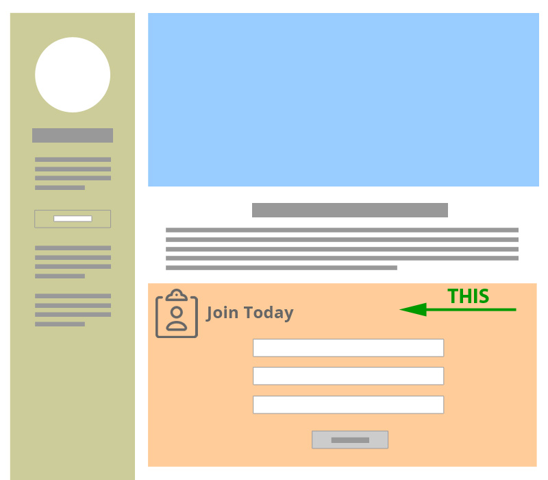
Form as part of main content
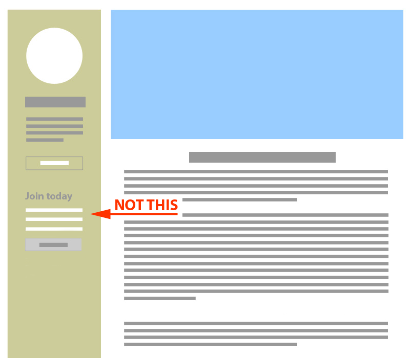
Form hidden in sidebar
Make it Easy to Take Action
One of the most effective things you can do to improve conversion rates is ensure that the process, whatever it is, is as simple as possible for users to complete. This is often described as minimizing "friction" that makes it difficult or distracting for users to complete the desired conversion action. For example, does your conversion goal require the user to visit a new page or access additional information before they can complete the task? Does your inquiry form require the user to complete more fields than you actually need? Might you be providing too many options? Are the instructions confusing or ambiguous?
Reducing friction is a key step to improving conversion rates. The easier the process, the greater the likelihood that users will complete the action. On the contrary, the more that you require of your visitors and the more barriers you put in front of them, the higher the bar for completion and the lower the likelihood that they will complete the task (note: there are exceptions where you may want to deliberately raise the bar for completion and ask more of your visitors in order to limit your conversions to a more narrow audience of highly qualified individuals, but for most businesses this is the exception rather than the rule).
Examples of elements that contribute to friction and reduce action include:
- Information/instructions that is confusing or unclear
- Too many choices
- Too many requirements
- Page UI that is cluttered or distracting
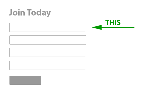
Simple form with fewer fields
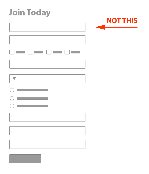
Complex form with many fields
Apply a Call-to-Action
Regardless of the action(s) that you want users to take on your website, you will need to make sure that you have a prominent call-to-action (CTA) in order to entice visitors to interact with your page. Your call-to-action should be clear and easy to see, as well as instructive and action-oriented. After all, you need to get users to see the opportunity before they can act on it.
Common examples of CTA's include familiar actions, such as:
- Join Today
- Try for Free
- Learn More
- Buy Now
- Get Started
The way you format your CTA, and where you place it within your page's UI/design can also have a substantial impact on conversion rates. A common pitfall is simply placing the CTA within standard paragraph text and assuming that's sufficient to entice visitors (it's usually not). Making your CTA stand out with text formatting, icons/graphics, and on-page placement location within the user's eye path can greatly impact your CTA visibility.
Consider the following examples - which do you think will capture visitor's attention and entice visitors to take action?
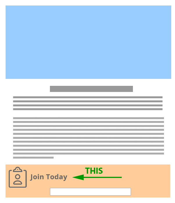
Form with large call to action

Form with small call to action
Emphasize the Benefit
OK, so we've covered the fact that your conversion goal should be clear and easy to accomplish, with a prominent call-to-action. For optimal results you'll also want to make sure that you reinforce any key benefits that will motivate your visitors to take action now rather than some other time. To do this, consider the psychology of your target audiences - what might be their primary incentive for interacting with your business or organization; why would they want to contact you?
For example, if you want users to sign up for a newsletter, let them know what types of content it will contain; will it provide special features, updates, or items of interest to your target audiences? If you are offering a service, are you going to provide some type of free initial consultation? If you are offering a product, is it on sale, or available for a limited time? Giving your users a clear reason to take action will help them to do so.
Other Factors to Consider
In addition to on-page measures you can take to directly manipulate your conversion goal tasks, there are also a number of broader factors that can impact conversion rates, including:
- Seasonal Impact - does interest in what you offer tend to change at different times throughout the year?
- Special Promotions - are you doing any advertising or special promotions that might be driving more qualified visitors?
- Page Speed - does your page load quickly and reliably on both WiFi and mobile networks, is it optimized for speed?
- Page Layout - is you page layout/UI confusing or cluttered; does it make it easy for users to scan information on the page and see your call-to-action?
- Security - does your site have any security issues that might trigger warnings or otherwise discourage users, does your site properly apply SSL?
- Device Compatibility - is you site mobile-friendly and easy to use across a range of devices, from desktops to tablets and mobile/handheld smartphones?
No matter how well you optimize your site pages to convert users, any of these factors can also have a significant impact on performance, so it's important to take these considerations into account when assessing conversion optimization and performance.
Ultimately, the fundamental elements to drive conversions on your website are relatively straightforward - know your target audience, clearly define the actions you want them to take, and make it easy for them to accomplish the task. But there are a range of ways to implement these basic principles that can vary quite a bit depending on your particular goals and audience. While there is no magic bullet that will produce the same results for everyone, these guidelines, along with a process of experimentation and measurement, will put you on the road to lasting results.

To learn more, simply complete the form below and we’ll be happy to follow-up with additional information, including:
- Needs Assessment
- Cost Estimates
- Questions & Answers